Since it doesn’t do to wing it before discussing economics with someone who has a reasonably sophisticated grasp on the subject, I thought I had better acquaint myself with the latest statistical updates before attempting to talk about them in public. What is interesting to note in all of this recent inflation hysteria is that the rate of increase of the CPI-U measure of price changes and the M2 money supply measure are both presently below their 50-year average. Below is a chart showing the change in CPI-U and M2 on a monthly basis since January 2008.
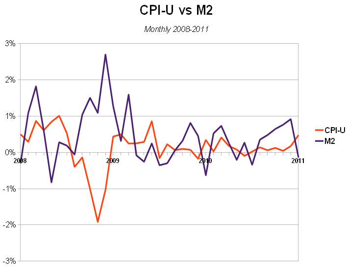 The average annual growth over this period is 1.44% for CPI-U and 6.16% for M2. That sounds like a lot, but to put it in perspective, the average annual growth over the 51 years from January 1960 to January 2011 is 4.13% for CPI-U and 6.86% for M2. It’s far below the record three-year periods of 1978-1980 in which CPI-U averaged 11.6% growth per year, or when M2 growth averaged 12.2% growth in 1977-1979. And while it is absolutely correct to doubt the veracity of these government-published figures – anyone who goes through the M2 statistics won’t miss the discrepancy between various H6 reports for the exact same month – but since these statistics are being used to support the inflationary case, the fact that they are not increasing at an unusually rapid rate must be taken into account.
It hasn’t escaped my attention that gold, oil, and commodity prices are all increasing. Neither have I failed to note that other prices are continuing to fall. The collapse of housing prices, down 31.4% from their 2006 Case-Schiller peak and falling at an annual average rate of 7.9% over the three years covered in the chart above, are much more indicative of a deflationary environment rather than an inflationary one. How do we balance these contradictory indications? I expect that is a question that Mr. Schiff will probably want to discuss.
 Now, in the video entitled Four Keynesian Inflations, I explain why attempting to measure inflation in terms of CPI and GDP makes absolutely no sense, despite the fact that this is how the financial media always describes it. But, even if we accept the idea that inflation is the rate of dollar price changes (CPI) in excess of the rate of economic growth measured in dollars (GDP), it should be obvious from the chart entitled Inflation 1960-2010, which subtracts Real GDP from CPI-U, that inflation is neither at a historically high level nor is it even increasing at the moment. I think the chart demonstrates even more clearly that the Samuelsonian metrics involved are almost completely worthless as they clearly do not measure what they purport to measure, but since they presently frame the context of the mainstream economic analysis, it is necessary to take them into account.
Since we’re apparently also going to be discussing Federal Reserve Chairman Ben Bernanke, it may be helpful to read his most recent report to the Congress if you want to follow along.